For this final installment in our brief study of the valleys and pitfalls into which animators can venture without proper care and attention, I’ll first spotlight a recurring problem, sort of a subset of the cycle errors discussed last week. that nearly every studio who attempted it ran aground upon during the 1930’s. Then, our primary focus – when some scene just feels out of place, because it doesn’t match the details of another, doesn’t match the plotline as already established, or seems to change the whole motivations of a character – what both live-action and animation producers would refer to as the “continuity error”.

A near sub-genre of cartoons appeared during the early to mid-1930’s, possibly deriving from some animator’s sweet tooth. It was becoming a convention of animation, probably inspired by Disney’s Silly Symphonies, to venture beyond the realm of anthropomorphic animals and the wilds of the woodland, into new “worlds” where inanimate objects sprung to lives of their own, and cavorted in entire settings or communities populated by and devoted to the needs of their kind. Disney and Harman-Ising specialized in varieties of novelty and specialty shops which would come to life at midnight or when their proprietors locked up for the night. Wax museums made the rounds, spinning off from the success of Warner Brothers’ Mystery of the Wax Museum. Burt Gillett would take us to a community of clocks (Van Beuren’s Grandfather’s Clock), while Ub Iwerks would give us a colorful view of Balloon Land, and Leon Schlesinger and Friz Freleng would predict the world of Cars with Streamlined Greta Green.
 Somewhere in this flurry of mini-re-creations of the Book of Genesis, someone envisioned a brand-new domain – the kingdom of candy. The idea seemed to spread like wildfire, with most of the major studios getting into the act within a short few years of one another. However, the then-popularity of a particular type of candy, usually relegated these days to only the Christmas season, but then the kind of thing one might find year-round in any corner confectionary store where regional or hand-made treats were displayed, caused the animation industry no end of trouble. The peppermint stick, or what we conventionally refer to today as the “candy cane”. This goodie was always traditionally identified by a unique design – a spiral stripe, most often in red, layered continuously around the cylindrical column of the confection (sometimes as a straight stick, sometimes curved into a hook to allow for hanging of the treat upon a Christmas tree limb). While the stripe wasn’t a necessary component to the item’s flavor (and usually washed-off entirely after a few licks), it was the only way a film-viewing audience would be able to discern that they were looking at something sweet and a bit tangy, rather than at the bare white of a blind-man’s cane. Thus, the task befell animators to duplicate this striped trademark in order to convey their fantastic visions. This led to quite a lot of what the industry would call “pencil mileage” in creating the arduous number of drawings necessary for a fully animated film – and also to an awful lot of problems in the ink and paint division.
 As one looks at a cane from almost any direction, the pattern of a peppermint stripe will appear as a series of small, slightly curved segments across the width of the cane, generally of even dimensions between red stripe and bare white surfaces. So how do you instruct a painter which stripe is red, and which is white? There are so many along the expanse of each cane, anyone drawing indicators on the pencil drawing would probably feel overworked were arrows and letters necessary to insert for every stripe upon every drawing. Similarly, few animators or inbetweeners would be likely to relish the thought of having to hand-shade with pencil every stripe that was supposed to be colored red. Most likely (though unfortunately I’ve never seen any surviving pencil drawings which would verify this), common sense would dictate that, at most, an indicator arrow might be provided on a pencil sketch identifying a single one of the stripes along a cane’s expanse as being red – then leave it to the good sense of the painter to assume that every other stripe along the cane should be red also. Where a cane was supposed to remain relatively motionless throughout a shot, the temptation might be to get even lazier, and merely indicate where a red stripe was on the first of the drawings in a sequence, then trust the painter to use the same instruction as guide for coloring all the rest. This, however, is possibly where communications started to break down. Painting an entire run of cels, even for the fastest in the business, had to take several hours, and in many instances, days. Attention of a worker might be easily distracted with the passage of such time, and one can easily imagine painters passing the time by engaging in conversation with a fellow worker across the desks, or breaking for a pit-stop or a bite to eat – and in the process, forgetting whether the reference stripe in a drawing sequence was red or white. A completed cel, painted with the stripes in reverse pattern, would in isolation from others look like it was completed just as well as a properly-painted one, and might easily go unnoticed until the final photography revealed its jarring failure to match the others. Sometimes, an attention-lapse would get worse, and there are instances where an errant cel will accidentally include two stripes in succession painted the same color, with the rest from there on alternating in color, but in the wrong places. Were such problems rare? Not on your life, and it seemed as if the smaller the studio, the more of a guarantee you had that it would show up. It became nearly the badge of marketing a product fast and on the cheap to include some peppermint stripe in at least one film that would flicker from one pattern of stripes to another for a few frames or more.
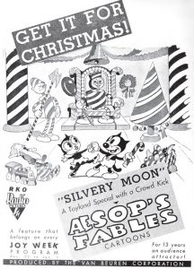
 One of the first to face this problem – in black and white – was Van Beuren’s Silvery Moon (1/13/33). This little curio inaugurates the strange concept that the moon is not really made of green cheese, but of cake, candy, and ice cream! Oddly, the film does relatively okay with the striping of routine sticks, and with well-detailed backgrounds adding peppermint-striped instruments to a musical number modified from old animation reused from Toy Time (1931). Where it falters is with a few fancier shots within a lunar palace. First, at approximately 2:40, we are introduced to two palace guards, whose bodies would suggest they were mechanical robots except for being candy-striped, as they are entirely built of peppermint sticks. Their stripes are all over the map, with black changing to white and back again throughout the shot (affecting the entire body of the guard on the left, while the one on the right seems more restricted at first to irregularities in his arms and legs, then switches to torso-stripe problems as he exits). We then meet the lunar king. He is also made of peppermint, but with an unusual “twist”, The stripes from his ankles to his head rotate slowly around his expanse like the moving stripe of a rotating barber pole. The animators at first get this idea across amazingly well, with no blunders, at approximately 2:57. But then, the king moves, standing to welcome his visitors, and waving his arms to direct them to the chamber of candy-striped instruments. As he does so, parts of his torso, and his arms and legs, make the traditional surprise exchanges in coloration, again spoiling the shot. Knowing the small budgets and the limited artistic training of the staff at Van Beuren at the time, this cartoon was probably already pushing the limits of what the small outfit could afford or had the talent to create, and so, as might be expected, any reshoots were probably out of the question.
Ub Iwerks has no particular problem with striping colors in Jack Frost (ComiColor, 12/24/34), but restricts such animation to only two shots, as Frost magically converts ice bars imprisoning a young grizzly bear into peppermint sticks by an application of color from his season-changing paintbrush. The bear licks one of the bars to dissolve it, forming an opening large enough to free himself. The outlining on the bar which is licked, however, is irregular in registration, causing the stripes to wobble up and down somewhat as the stick is licked away. Then, we add a continuity error to go with those discussed below, as a shot from within the bear’s imprisonment shows the dissolved bar to be the second in line, while the next background from outside shows the gap where the third peppermint bar should have been!
 Disney would face the problem on three early occasions. His first, Babes In the Woods (UA, Silly Symphony, 11/19/32), a rather dark retelling of the tale of Hansel and Gretel, went by rather flawlessly, though the studio was wise enough to include stripe animation in only one or two shots at the witch’s house of candy and pastry. Disney also performed flawlessly in the work-for-hire, “Hot Choc’late Soldiers”, a full-blown Silly Symphony-style short included within the all-star MGM comedy, Hollywood Party (6/1/34), winning the artistic war although the multi-striped sticks appear as weaponry throughout the film. I had originally thought the Disney masterpiece, The Cookie Carnival (UA, Silly Symphony, 5/25/35) was also flawless, but a closer inspection revealed a few suspect oversights, of such minimal impact on the production that one can easily see why they did not call for retakes. At approximately 0:38, a parade float includes about a half-dozen damsels with peppermint-stick legs, standing upon a cake rotating like a merry-go-round. As the rotation takes place, the stripe lines appear wobbly, and there seems to be some minor and momentary color-switching upon one damsel toward the rear of the float. The next float features an eskimo-style damsel made of cocoanut, riding atop a sleigh featuring candy-cane runners. Only as seen at the end of the shot with the rotating cake, as the sleigh’s canes are barely entering the shot, can we observe some stripe-swapping on the forward end of the cane at farthest distance from the camera. When the shot cuts to similar drawings of the sleigh in full view to showcase its passenger, the color problem has been fixed, and the stripes stay in the places they belong. A later dancing sequence by the “Dandy Candy Kids”, whose anatomy features multi-segmented peppermint sticks, is so perfectly rendered that I doubt any other studio in Hollywood could have come close to matching it. Perhaps the film’s biggest error (if you can call it big) doesn’t involve peppermint at all, but a reflection upon a red lollipop that keeps disappearing for a frame, commencing at approximately 0:34.
One blogger last week commented upon the various animation errors in the high-budgeted (for Walter Lantz) color Cartune Classic, Candyland (Universal, 4/12/35), which has also recently been spotlighted in James Parten’s “Lantz – a Lot!” column on this site. While some of these errors are indeed outrageous (such as disappearing and re-appearing squares of chocolate on a moving conveyor belt), I was actually surprised that a peppermint-striping error does not seem to appear within those shots featuring such sweets in the film. Though these scenes are comparatively few as opposed to other types of candy being worked on, I wonder how Lantz managed to avoid the common painting problem, while letting in other boo-boos that should have made the final checkers’ eyes pop.
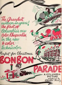 Charles Mintz produced a dandy in the wake of The Cookie Carnival, as his own first effort in three-strip Technicolor, Bon Bon Parade (Columbia, Color Rhapsody, 12/5/35). For a concept likely rushed to production within a half-year, the film is for the most part amazingly flawless, finely animated (particularly in a precision march of a peppermint-stick soldier brigade), and features both dazzling special effects and a great use of color, particularly in a spectactular fireworks display ending the film. Where it falters, however, is in other shots of candy-striping, giving away the limitations of its quality-control personnel and/or its budget for retakes. At approximately 5:08, a calliope upon a parade float is revealed, as a roof of the float rises upon four peppermint-stick poles. All four red and white poles display varying degrees of stripe-interchanging as the roof rises to full height. Surprisingly, the calliope pipes (also made of striped candy sticks in green and yellow) maintain their proper stripe positions throughout the expanding and contracting musical action of the shot. At approximately 5:26, a wild animal cage enters on a float, its bars all made of striped candy sticks. The first bar seen entering the shot glaringly shifts color about every quarter of a second, while a green and white bar in the far rear of the float, partially cast in shadow, features a repeating cel where two consecutive stripes are erroneously painted the same color about three-quarters of the way down the stick, throwing the color of all stripes below off by one line, leaving the bottom third of the pole changing color while the top remains stationary. A final error does not involve the stripes, but instead is of the voice-switch variety discussed last week, as the king of Candy Town sings three consecutive lines of a song at approximately 3:52, even though he is singing in three different voices, two of the lines properly intended for his lollipop palace guards, who accompanied him in an earlier shot.
We may never know how Max Fleischer would have handled the issue – or perhaps we actually do know (by avoiding it entirely) – in his own three-strip Technicolor debut, Somewhere In Dreamland (Paramount, Color Classic, 1/17/36). Though the setting of the film (the dream of two depression-era children, as they venture into a land where new clothes grow on trees, ice cream and cake grow from plants, and free toys are for the taking) would have been the perfect setting to see more peppermint sticks turn up, nary a one is to be found on the screen. Maybe Fleischer had seen enough of what had happened to his rivals, and wisely issued an edict before production that peppermint was definitely out. Good move.
Speaking of Fleischer, he is as good a starting point as any for the subject of continuity errors. As referenced in the introduction, these are situations which may arise from something as simple as failing to communicate between departments or animators, or on occasion from simple scriptwriting oversights, leading to a progression of shots which either don’t make logical sense or don’t spatially exist comfortably together in a continuum of storytelling. In live-action filmmaking, such predicaments can often occur from the non-sequential photographing of shots (such as, perhaps, grouping close-ups or dialogue lines of the same actor in one day’s takes, then shifting to the actress he’s supposed to be conversing with for the next day’s shoot, then trying to splice the whole thing together as a continuous conversation in the editing room). Little changes in position of props, wardrobe, sound ambience, or other minor details might spoil the editing process, giving away that the scenes were not shot at the same time, and perhaps the characters were not even on the same set. Similar problems can occur in animation, where drawings are rarely produced in sequential order between animators, and labor may be split among diverse hands. Unless the artists know the details of the story and sets backwards and forwards, follow the same model sheets as their co-workers, and have at least a general idea where the shot intended to precede their own work ends, a splicing together of the work of various animators can result in some quantum leaps of movement or expression, and possibly give away the differing artistic styles of each respective artist, so that the same character appears to have multiple sets of facial or movement variations and even changing personality traits within the same film. Some of such variation happens naturally, often allowing those of us with a keen eye to discern a particular artist’s drawings without the need for research into studio records as to who was assigned each shot. But if coordination is allowed to become haphazard, these variations can magnify to amazing proportions, spoiling and intruding upon the entertainment value of the final production.
As I said, Fleischer provides us with a good example of one hand not knowing what another is doing, in Betty Boop’s Stopping the Show (Paramount, 8/12/32). On a vaudeville stage, Betty performs impressions of various celebrities, one of whom is Fanny Brice (later known to millions of radio listeners as Baby Snooks, and the subject of the Broadway play and film, “Funny Girl”). Someone doesn’t inform another in the background department how to spell the name Fanny. The result is that two different backgrounds are produced, presumably by two different artists, depicting a poster displayed on stage with a photograph in center of the real Fanny Brice. In the long shot of the poster, the name Fanny Brice prominently appears above the photo. But in a close-up on the poster (at approximately 4:27), the first name spelling changes to “Fannie”. As it seems that the real-life voice of Fanny is provided for the soundtrack of the film, allowing the poster to inquire whether Betty will do an impression of her, this must have been particularly embarrassing to the guest star when the final film received public screenings.
 In my previous writings this year about baseball cartoons, two Warner Brothers titles turned up with miscommunications between writers and animation crew, resulting in non-matchups of imagery with storyline that leave one scratching one’s head. Porky’s Baseball Broadcast (7/6/40) can’t make up its mind what teams, or players thereon, are supposed to be playing. A newspaper headline proclaims that today’s contenders are the Giants and the Red Sox. Then why is the game played at Yank-um Stadium? Worse yet, why is the Sox’s two-headed pitcher (who pitches all their double-headers) suddenly removed from the film without ever taking the mound, and replaced with a pitcher clearly wearing an outfit with the insignia of the Chicago Cubs? Did this whole thing come out as confusing at the storyboard level, or did something happen along the way to change what was originally written, after portions of the filmed narrative were already in the can?
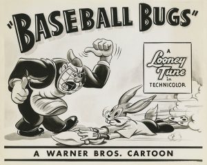 Then, there was Baseball Bugs (Warner, Bugs Bunny, 2/2/46). At approximately 1:47, the scoreboard is showing an escalating succession of runs by the Gas House Gorillas, which as seen in the numbers tallied for the first four innings would already add up to 96 runs. Yet, in the bottom of the 9th, the Gorillas’ score is only 95 (and stated as such by the stadium announcer)! You do the math – but who didn’t within the studio? The film also falls into a writer’s lapse in trying to build to a suspenseful finish, having the Gorillas come to bat in the bottom of the ninth needing a home run to win – except that they were announced at the beginning of the film as the visiting team – meaning that they should have batted first in the inning, leaving Bugs a chance to tie or catch up in the bottom of the inning whether they hit a home run or not. As discussed in my prior column, this rule discrepancy as to who bats last actually appears in more than one cartoon from more than one studio – so it seems anything goes when you want a story to reach a quick and determinative resolution.
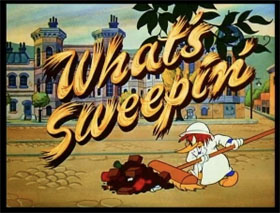 Character designs could make for some odd lapses of continuity. Sometimes, a character’s choice of outfit for a particular story would not match his usual physical appearance, and require a new look which didn’t match the character at all. Woody Woodpecker’s What’s Sweepin’? (Lantz/Universal, 1/5/53) featured Woody as a turn-of-the-century district street cleaner, in a uniform of white from head to toes, but open in the front, exposing his crest area. Woody’s chest since the mid-1940’s has been traditionally white, so there would normally be no color contrast between his chest and the fabric of his uniform if drawn properly. But what did the director decide to do? Paint Woody’s chest as a solid blue – a color normally reserved for his sides and back. We weren’t supposed to notice that somehow, Woody’s anatomy had undergone feather implants?
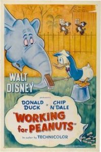 Similarly, Disney’s Working for Peanuts (RKO, Donald Duck, 11/11/53) features Chip and Dale, intruding into Donald’s zoo after a diet of Grade A peanuts, by covering themselves in whitewash and passing themselves off as rare albino chipmunks. They are provided with plenty of eats and a comfortable habitat, complete with scale model-sized swimming pool. Dale, upon seeing the pool, immediately races to the diving board to jump in. “Stop, you fool”, says Chip, catching Dale just before he completely disappears into the water, but leaving him waist-deep in the fluid, washing off half of his paint. Donald turns, catching sight of the color change, and eyes Dale suspiciously. Dale thinks up an excuse for his appearance on the spur of the moment, and uses one finger of each hand (paw?) to wipe away more paint, tracing a line from each side of his waist, over his shoulders, and down his back. “Suspenders, see?” he tells Donald, pretending the brown Donald sees is a pair of pants. Donald is sarisfied, and leaves the chipmunks to enjoy their day in peace. “We sure fooled him”, says Chip, in appreciation of Dale’s quick thinking. “Yup, we sure did”, responds Dale, proudly tugging at and stretching the lines which appeared to be suspenders, allowing them to snap back against his shoulders, as if the trousers suddenly became real. Chip is left puzzled, shrugging his shoulders, for the iris out. But the audience should be even more puzzled than Chip. For when the whitewash disappeared from Dale’s lower torso, both his chest and his legs appear in one continuous shade of brown (though someone does remember to show a little bit of the wbite and black striping over the top of Dale’s tail). This in spite of the fact that, through three-quarters of the film, both Chip and Dale have been seen in their normal, natural colors – with a flesh-toned chest extending down between their legs. So where did the flesh tone go? It was obvious that the suspenders gag would not have worked properly had Donald seen Dale’s lower half revealed in two contrasting colors of fur, as such color variance would not appear on a pair of trousers. So everybody just hoped that no one would notice or raise a fuss, just to force through a gag which really didn’t fit the characters putting it over at all. It’s amazing that Disney didn’t insist the writers come up with a more plausible ending that didn’t depend upon an entire color inconsistency. The presence of this cheat of an ending has always bothered me about this film, right from my first viewing as a teen decades ago.
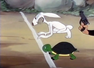 If an animator is too headstrong in his own approach to follow the models of everyone else, the clash of appearances of a character within one film can also be a problem. Jim Tyer developed quite a reputation for this, largely refusing to draw characters on model, and always seeking to depict them in his own elastic, almost rubber-hose brand of facial and physical distortion. Yet, Terrytoons, and also Paramount, considered him invaluable for the energetic power behind his drawings (and probably the speed and cheapness with which he could turn them out by not worrying much about their overall neatness of appearance), and largely let him have his head. Results thus were normally a dead giveaway in telling which scenes were animated by Tyer, versus those drawn by more meticulous but less energetic artists around him.. A classic case of inconsistencies resulting from such conditions appeared in Terrytoons’ A Hare-Breadth Finish (2/57). The short is a clever and fast-paced pickup by Terry on the by then abandoned character clashes between Bugs Bunny and Cecil Turtle, using Terry’s own version of a hare, but a turtle who sometimes is a dead ringer for Cecil, in a tale of yet another rematch race to clear the name of the hare from the ever-lingering bad reputation of having lost so miserably to the tortoise. Like Bugs, the hare thinks he has all the angles and dirty tricks irobed out to guarantee a victory this time, but circumstances conspire against him, to end up with the same, inevitable result. The film definitely smacks of Warner Brothers, and is quite fun if only for that Warner feel. However, the not-so-fine hand of Tyer keeps slipping its way into various shots. Of course, as we might expect, it takes a first-chair position in many of the rabbit’s fastest speed shots. But the most curious aspects of it are in the decidedly slow sequences involving the turtle. For reasons only known to Tyer, every one of Tyer’s shots of the turtle’s slow plodding depicts him with solid green feet – even though the other animators’ shots all show the feet with distinct black toenails! Tyer was known to be quite secretive about his techniques for depicting action, and usually wouldn’t tolerate others looking over his shoulder. So it’s possible Tyer performed his drawing entirely in private, and didn’t let the others see what he was doing until the drawings of all were completed. In this way, he likely didn’t share with the others that he had either ignored or chosen to delete the toenails, resulting in the notable inconsistency of shots.
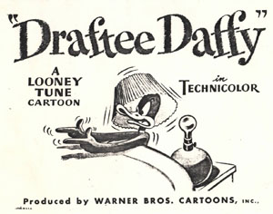 Speaking of inconsistency between animators, one might wonder what exactly happened in Warner’s Draftee Daffy, a Bob Clampett production from 1/27/45. In his efforts to escape from “the little man from the draft board”, Daffy has sealed himself up on a closet. But of course, the little man is already inside, right behind Daffy. At approximately 4:19, there is a classic case of indecision at what Daffy’s reaction to the man should be. Just after the man mildly makes his presence known (with the catch phrase of the character of Mr. Peevey from radio’s “The Great Gildersleeve”, “Well, now, I wouldn’t say that”), Daffy first reacts in the same shot by his eyes widening in height considerably, and his beak drooping. Then, the scene cuts to a close-up. The expression on Daffy’s face does not match what we have just seen at all, as for a brief instant, Daffy’s eyelids seem to be relaxed to almost a half-closed position, and there is a slight smile on his beak. Now, he shakes his head in quick bewilderment, then, while his head continues to face the interior side of the closet door, his eyeballs whip around to the back side of his head, to react with shocked vertical stretching at the figure they see behind Daffy’s back. The close-up is a funny take, but why didn’t it begin with Daffy already in surprise? Then, when the scene returns to our original two-shot angle, it appears to have picked up right where the animation of shot one left off, with Daffy still in forward pop-eyed pose, and turning his full self to perform a shock take, briefly suspended in mid-air. It looks as though that one was cut into two parts, with the close-up inserted in the middle at the last minute to provide an additional laugh.
But why such a bad job of matching shots? It is possible the close-up was something adapted from old animation which Clampett already had in the can, intended for another film, and inserted at the last minute on a whim to find a place for it, irrespective of the fact that no animator was called back to match expression at the beginning of the shot. A similar situation happened in The Hep Cat, where a reaction of the cat to a female, showing his tongue hanging out in heavy panting, was really from a scene Clampett had been unable to pass by the censors on a previous production, Hare Ribbin’ (where the same reaction is performed by a dog in the rare “director’s cut” reel unearthed from the Warner vaults). This theory of a last-minute insertion of repurposed animation would also make sense for the reason that most wild takes in Clampett films of the day were performed by one particular animator – Rod Scribner, who receives sole animation credit on this film. Not that Scribner was likely to have really done all the key drawings – but it is unmistakable that the two-shot between Daffy and the draft man features signature squinting and surreptitious eyes on Daffy that were also seen in Foghorn Leghorn cartoons on which Scribner later worked. So if Scribner animated the two shot, odds are he also animated the key close-up, meaning that he certainly would have known what position he last left Daffy in, had the two scenes been animated sequentially. However, by digging into his old artwork for an extra gag, Scribner would have been deprived of the chance to correctly match the beginning of the close-up with the ending of the two-shot – consistent with what is on screen. Sometimes, a little deductive thinking and detective work is necessary to provide the key to solving a baffling mystery such as this – isn’t that right, Duck Twacy?
• A good print of “Draftee Daffy” is on Reddit.
 Woody Woodpecker’s Busman’s Holiday (7/25/61) is another story that has always bothered me. Overall, a good slapstick tale, somewhat in the vein of old comedies of the Hal Roach era, centered upon a hazardous bus ride of Woody while carrying an amazing prop – an automatic extending and retracting ladder for washing windows, which chooses all the wrong moments to expand and retract uncontrollably, through the bus’s windows and roof, and into the back of the head of the driver. The short would rank among Paul Smith’s better efforts – were it not for a problem in continuity that just plagues me. The bus route on screen seems to follow a long lineal path in one direction for miles, without so much as rounding a single corner. Yet, somehow the bus always seems to be passing the same location – Pierre’s Bakery, the spot where Woody started his trip, and causing repeated mishaps to the irate baker. There is also a cop who falls down a manhole, who is passed over by the bus more than once, and a junkyard dog who seems to catch up with or be passed by the bus repeatedly. So is this bus doing nothing for a six minute drive but circling around the block? And if its route is so short and repeating, why does Woody complain at one point when he is thrown out, that this is not the place he wanted to siop? The farthest he could have been traveling would have been halfway around the block, which it appears he should have already easily reached given his travel time! Let’s check out that bus timetable and route schedule a little more carefully, shall we?
• A proper speed print of “Busman’s Holiday” is at Archive.org
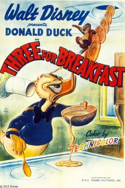 Back to Chip and Dale, another episode which takes a remarkable directorial liberty in defiance of what the audience has already seen is Three For Breakfast (RKO, Donald Duck, 11/5/48). Donald has tried to upset the chipmunks’ rampage of thefts of his breakfast pancakes, by creating a fake hot cake cooked from liquid rubber cement, and letting them fight over it. The chipmunks still don’t really get that the large cake is a fake, and ultimately decide to make off with all the good pancakes and the bad one together, up the vent pipe in the ceiling over Donald’s kitchen stove. Donald grabs desperately for the last cake going up the pipe – the rubber one – and stretches it to the limits of its endurance, pulling backwards, as he winds its stretching form around various objects of furniture in the living room, then in a cutaway shot through the lengths of four more rooms of his home, out the patio door, and all the way up to the roof, where he confronts the chipmunks, still holding onto their end of the rubber cake. Dale pills a fast one, with a stick of butter somehow also rustled from the kitchen without notice of either the audience or Donald. Dale spreads the butter in a trail behind Donald on the roof, then taps on the back of Donald’s ankle. Donald unthinkingly lifts his leg to allow Dale to pass under, and while Dale does, he slathers butter on the bottom of Donald’s foot. When Donald plants his foot down again, he loses traction, and begins sliding backwards, as the rubber cake pulls with contracting force to make him reverse his path. Donald falls off the roof, is dragged back through the patio door – but then performs the impossible. He first whirls around all the objects he has wrapped the cake around in the living room, then is seen zipping back through the other four rooms of the house, before ending up back in the kitchen and dragged upwards into the vent pipe. How did he reach the living room before passing through the other four rooms, if he is reversing his path? Director Jack Hannah, for some odd reason, must have felt that timing looked funnier if the one-room shot was followed by the four-room shot each way. I’ve never heard anybody complain or pay much notice to this one, but my family easily caught it the first time we screened my super 8 print of the picture – and always brought it up on each subsequent rerun. Certainly, others must have secretly noticed too.
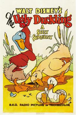 Another one my observant family was quick to notice from super 8 screenings was a terrific continuity blunder in Disney’s 1939 Academy Award winner, The Ugly Duckling (RKO, Silly Symphony, 4/7/39). At approximately 7:22, our title “duckling” has his moment of realization, when he discovers four other “ducklings” – actually cygnets (baby swans), who look just like him, and accept him for what he is. Our hero is so happy, he jumps into the water and cavorts with his four new friends for a few energetic moments. Did I say, four friends? Well, there’s some confusion on that point. The action of the characters in their play complexly criss-crosses on the pond water, with our hero ending up in the center of it all. Yet, for a few fleeting moments, the count of cygnets on the pond adds up to a grand total of – 6? As the scene approaches the end of its allotted time, one of the cygnets on the perimeter suddenly turns to the left, swims away out of frame, and is never seen again! As Cecil the Sea Serpent might have said, “Wot the heck?” Was the swimmer a total stranger, who just happened to also be on the pond and hogged the shot to get a free moment of screen time on camera? Or was he a brother of the others, who simply decided at this critical moment in life to strike out on his own, leaving an opening for the mother swan to fill by taking the “ugly duckling” on as one of her own brood? Or did some animator, assigned only so many frames for his shot, get himself into a bind by animating action too complexly, accidentally starting one duckling into the shot before he realized he had no remaining time for him to exit the scene to keep the count of cygnets straight – so was forced to make another cygnet take a hasty exit to reduce the count back to five by the end of the shot? I guess it’s easier than scrapping a whole night’s work of path plotting – but, come on. Are you saying nobody in the executive office noticed this? You really could have fired or demoted the animator, and paid for a redrawn shot, if your quality levels really meant anything to you.
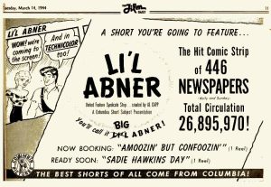 There were other instances along the way, and extending well into the television era, where simple writing choices, independent of the animators’ efforts, would result in pizzling inconsistencies in a character’s motivations, either between respective episodes or once in a while within the same story. Columbia’s “L’il Abner” cartoons were an example. In episode 2, Sadie Hawkins’ Day (5/4/44), Mammy Yokum exercises all of her super-strength to run interference for Abner to save him from the clutches of Daisy Mae and instant matrimony by operation of law. However, by her next appearance in A Pee-kool-yar Sit-chee-ay-shun (7/26/44), she has come around full circle, and hustles in Daisy Mae from a tryst intended to make Abner jealous, in apparent hopes that Abner will pop the question. In Kickapoo Juice (12/1/44), she also breaks up the private brewery of Lonesome Polecat and Hairless Joe, simply to get them married so that they will not be the object of hero worship by Abner as perfect examples of “Happy bachelors.” What brought on Mammy’s mood swing? My guess is probably some input by Al Capp himself, who may have thought that the Columbia team didn’t understand his character when producing the earlier film, and suggested that she had more than just protection of Abner on her mind as to his future. It was known that Capp was not fond of the films, and maybe this motivational misunderstanding was one of the central causes of it.
 I’m unaware of official explanations why Gargamel, midway in the run of Hanna-Barbera’s adaptation of The Smurfs, changed his motives entirely, from desiring Smurfs as an ingredients to alchemy and producing gold, to merely wanting Smurfs as a delicacy for his dinner table. I would have thought the latter motive would be a little too gruesome for the kids, considering the Smurfs aren’t wild animals to be hunted, but depicted as if little human beings. Sort of smacks of evil wizard cannibalism. And why, if you can use a Smurf to make gold, would you turn down a fortune just to obtain a tasty square meal? Even Wile E. Coyote’s charts on the variety of flavors in every cut of a road runner wouldn’t provide a convincing explanation of Gargamel’s change of appetite to young viewer Ralph Phillips.
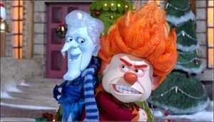 Rankin-Bass’s The Year Without a Santa Claus (12/10/74) suffers from similar motivational confusion. Shirley Booth (as Mts. Claus) seems to start out the story feeling that Santa’s idea of staying home this holiday is a bad one, and is scheming to go so far as even impersonating Kris Kringle herself to save the holiday for the kids. However, as indicated by her narration at the halfway point of the film, as she embarks on her journeys to meet with Heat Miser and Snow Miser, she and her elf assistants are allegedly “determined that Santa should have his holiday.” Never was any explanation for this shift provided. I have never read the book, so wonder if anyone knows if the original story provides any coherent reason for this mood swing. Feel free to add your comments.
 Sometimes, a character reboot can also be jarringly inconsistent with the original. I was upset by the recent Tiny Toons Looniversity, which went way farther than it needed to on a rethink of the setup of “Tiny Toon Adventures”, invading principles that were emphasized as basic to its primary characters in the original. A well-worn catch-phrase of the original show was that Buster Bunny and Babs Bunny, who shared the same last “name”, would always qualify their introductions of themselves with the remark, “No relation.” It was a sure laugh-getter, and everyone remembered it. It also opened the door for occasional romance, as Buster was known to be in a mild dating relationship with Babs, and even got semi-serious once by taking her to the junior prom. So why did Spielberg authorize the reboot to cast Buster and Babs as brother and sister, destroying the traditional punch line and any hope of romantic stories as well? Was he determined that there should be no serious romance in a modern show perhaps aimed at adolescents, and if so, why? Don’t change your character’s whole sense of “id” if you want an audience to maintain franchise loyalty, and any fond recollections of the past when viewing your new product.
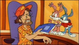
 A few final thoughts on continuity. Occasionally, a well-penned piece of writing can cash in on something that just doesn’t have a proper place in a storyline, by cleverly poking fun at it with self-criticism within a script. An example in live-action from the not-too-distant past involved one of the middle installments of the Harry Potter septology, in which a confusing and frankly non-understandable bit of time travel is performed by Harry, in which he somehow saves himself from a dementor’s attack by creating a petronum, even though the rules of the time-space continuum shouldn’t have put him in place to create the petronum when his life was already in jeopardy. It made no sense in the reading of the novel, and was one of the only major weak points in the story. When the filming of it was performed, the screenwriters covered over it by means of an exchange of lines between Harry and Hermione after the incident, drawing their own criticism into play before anyone else could make a wise-crack about it, and generating a good laugh. Harry describes the incident as best he can to Hermione, then asks, “Does that make any sense to you?” Hermione responds with a resounding “NO!!!” The laugh resolved the awkward moment, and the story went on. A similar situation occurred in the Tiny Toon Adventures episode, Buster and Babs Go Hawaiian (11/18/91), a script which was openly touted in the show’s dialog as submitted from outside sources by a group of grammar or middle-school students. We are thus in a sense forewarned not to expect anything too highly from this “masterpiece”. When a large, unexplained storyline inconsistency is encountered, Babs remarks, “That plot hole’s so big, you could drive a Mack truck through it.” On cue, along comes such a vehicle, rolling and rumbling through the set.
 A final example of comedically covering over an inconsistency is classically presented in Tex Avery’s Three Little Pups (MGM, Droopy, 12/26/53). In parody of the Three Little Pigs, Droopy and his dumb little brothers hole up in a brick doghouse, avoiding the windy huffing and puffing of the big bad dog catcher. The dog catcher tries to use a giant straw at the window to suck the pups out, but Droopy saves his brothers by pushing them out of the flow of the suction just in time. The air thus sucks upon the pups’ television set, which vanishes into the oversized straw, and becomes swallowed by the dog catcher, who now projects old Western reruns out of his belly. After a cut to a new scene of the dog catcher’s next nefarious plan, we return to an interior shot within the doghouse, where Droopy and his brothers have resumed their former positions, watching TV! Droopy calmly turns to the camera, and states, “Now don’t ask us how we got the television set back.”
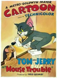 As a wrap-up, a tip of the cap to Hanna and Barbera, who managed in their glory days to produce a standout episode where, unlike any of hundreds of average cartoons, there is virtually 100% continuity, with every misstep of its central character going punished and with visible artifacts onscreen, instead of the instant healing powers so common to Wile E. Coyote and others as they transition from sequence to sequence. Tom and Jerry’s Mouse Trouble (MGM, 12/12/44), for which an Academy Award was earned, has Tom try to catch Jerry “by the book”, via a mail-order “Random Mouse” volume, “How To Catch a Mouse”. Every of its many chapters produces a resounding failure, and most of them some physical consequence to Tom. Tom ends up with his scalp shot off by a bullet (requiring the substitution of an ill-fitting red toupee), a black eye, sawed in half and stuck with pins (leaving a trail of bandages across his waist and torso), teeth lost by chewing upon and swallowing a wind-up female mouse decoy, and a recurring case of indigestion and hiccups, each of which causes the swallowed doll mechanism to repeat a sped-up version of Mae West’s catch-phrase, “Come up and see me sometime.” Finally, Tom throws away the book, using his own ideas by building a munitions dump around Jerry’s mousehole, including a block-buster bomb, and lighting a fuse. The explosion goes off too soon, and also has the odd effect of blowing away every bit of the house excepting Jerry’s mousehole. The consequences of Tom’s last backfired scheme remain right to the very end of the last shot, as Tom’s toupee falls from the sky, and we pan up to see a transparent version of him, sitting on a cloud with angel wings, but still bearing his bandages and wounds, and still hiccupping “Come up and see me sometime” Talk about continuity done just right!
 In closing this series, it should e noted that this was not the end of the story. Before the advent of computer colorizations, a rash of films were created for several major studios, using their old black-and-white prints for purposes of hand-tracing frames, in attempt to re-create both animation and backgrounds in new artwork in full color for re-photographing. It was a noble idea at its time, and not without a few decent-looking products – but all done ultra-cheaply in foreign countries (I believe, mostly in Korea), utilizing less than half of the drawings originally appearing in any given film, and adding into the mix any number of new tracing, inking, painting, and photographic errors, most of which outdid the outrageousness of any errors seen in the theatrical days by a mile. Any coverage of these errors would require another entire series of articles on its own, but some classics included lettering errors (Criro Syrup instead of Cairo Syrup in Little Beau Porky, “Wimby’s Brbr Shop” in Popeye’s A Clean Shaven Man, and “U S A Universal Cartoon” on the end title of Oswald Rabbit’s The Toy Shoppe), double exposures and missing scenes where one shot overlapped upon another in “Porky the Rainmaker”, background panning backwards in Columbia’s “Kickapoo Juice”, massive synchronization miscalculations in Betty Boop’s Ha Ha Ha, and just plain rotten tracing and skipping of key drawings in Betty Boop’s Snow White. Perhaps someone with the patience to rescreen through all this drivel can produce a series of articles to document everything that went wrong.
Oops! I’ve overstayed my page allotment for this week. Signing off until next time, and a new topic.