Cinecolor has its ups and downs for sure— but it’s sure fun to revisit old Castle Cinecolor Comi-Color prints!

First — a few Thunderbean updates:
With summer started here, my commitments at the school are a lot less — so it’s always a Thunderbean summer for me. This year, it’s almost all catching up— and we have a really good start by getting a lot of the ‘special sets’ in the can. I’m not sure how much longer we’ll do them, but getting a bunch out at the same time seems like a good strategy since we’ll be caught up a lot sooner.
I had a great time in Columbus, Ohio at the yearly Columbus Moving Picture Show. It’s a great event in both seeing a lot of movies as well as a ballroom-sized dealer’s room. For everyone that reads Cartoon Research and stopped by to say hi, it was nice to meet you or see you again! I really love chatting with people in person that enjoys classic animation.
We’ll be getting Mid Century Modern 3 finally out the door this month, along with another small barrage of special discs. To help move things forward, we’ve decided to open the ‘Special Disc Vault’ for a week, with 15% off all things. It’s a good time to grab anything you missed since it’s hard to say if we’ll offer them again.
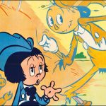
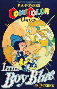
Now — onto our cartoon: The Big Bad Wolf (originally titled “Little Boy Blue”)- a 16mm reference print!
 We’ve been working for a while on the Comi-Color series here… with new scans of the black and white seperations coming in as we speak. They’re all from the negatives and master positives except a few from early in the series. Working with the original material is great. I love the look of the older Cinecolor prints and hope to get as close to that look as possible. Funny enough, I’m even a fan of the *different* versions of the color on the Comi-Colors: they look one way in the 35mm material, and sometimes, depending on the print, pretty different in the later Castle Films 16mm Cinecolor prints.
So: what’s correct— and what’s the best strategy to get it ‘right’??!?
In working from camera negatives, it’s almost impossible to get the exact look of a Cinecolor print. I think you can start to get pretty close, but the negatives are so much finer in terms of detail and contrast that it makes the actual Cinecolor prints look somewhat fuzzy and too contrast-heavy. This applies to both Cinecolor and Technicolor. Then again, the filmmakers understood the process in working with it, limitations included— so there was at least the knowledge that this process would yield a certain result.
This is the same struggle I had with the Blu-ray set we did of the Rainbow Parade cartoons, volume 1, all made in Cinecolor. The prints, some done in original release, some done later, in 35mm in 1942, some done in 16mm later, in the 40s and 50s were all over the place in terms of color timing and look. I tried hard to get some consistency in contrast, brightness and color saturation, but still didn’t make everyone too happy in terms of the ‘final look’- and, in hindsight, I wish I would have gone a little less saturated on some films. For some of the films, the 16mm prints were *far* apart from each other in terms of their look color-wise, and that was also really difficult to try and get some consistent grading on.
We’re working on the Technicolor Rainbow Parades really heavily right now. All of them are Technicolor prints, except one, from the negative. Having that one has been incredibly helpful for grading the others.
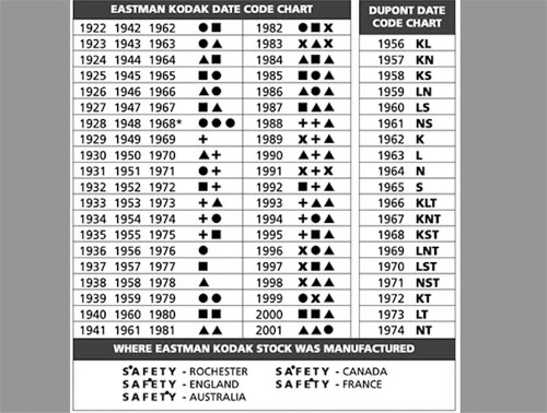
I’ve been scanning prints as well (in 16 and 35mm) for reference where I can. I’m using both 35mm and 16mm prints for this process. Here’s a print of The Big Bad Wolf (Little Boy Blue). It’s a 1947 Cinecolor print (note in the frame below it has two symbols (in this case square triangle) after the words “Kodak Film” (backwards in the scan). The symbols Kodak used for stock repeated every 20 years, and certain stocks are pretty identifiable once you’ve been working with film for a while. This notes that this print is from 1947 since the stock didn’t existin the 20 years before or after.
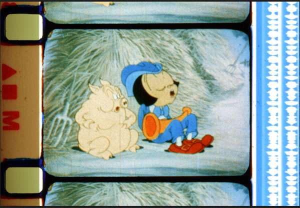
So— here’s that reference print I just scanned about a month back. The Castle prints tend to be too blue; to show this example and how it’s useful, I’ve pulled the blue down just slightly to balance. It’s a pretty nice print in terms of the color balance— and actually pretty close in color to the 35mm version-more so than some prints I’ve seen and am working with. I’ve left this print otherwise just as it was scanned, so you can get an idea of what a Cinecolor print and soundtrack looks like.
For those who know this stuff like the back of your hand, I apologize!
Have a good week all!